UX DESIGN
Good UX isn’t about making something look nice but rather making sure people don’t have to fight the product to use it. My process starts with understanding where users feel friction or confusion, and then asking why those moments exist in the first place. From there, I move into user research, wireframing, and mapping out flows to later test these ideas, refine its structure, and shape the interactions until they feel natural and easy to move through.
Below is an example of this process applied in a conceptual redesign of the Fable app where I focused on improving navigation, accessibility, and the flow of the discussion space. The visuals that follow show how research, ideation, testing, and refinement came together to address real user pain points and create a more thoughtful, user-centered experience.
Time: 2 weeks Tools: Figma, Adobe Fresco, Jotform
UX DESIGN
Good UX isn’t about making something look nice but rather making sure people don’t have to fight the product to use it. My process starts with understanding where users feel friction or confusion, and then asking why those moments exist in the first place. From there, I move into user research, wireframing, and mapping out flows to later test these ideas, refine its structure, and shape the interactions until they feel natural and easy to move through.
Below is an example of this process applied in a conceptual redesign of the Fable app where I focused on improving navigation, accessibility, and the flow of the discussion space. The visuals that follow show how research, ideation, testing, and refinement came together to address real user pain points and create a more thoughtful, user-centered experience.
Time: 2 weeks
Tools: Figma, Adobe Fresco, Jotform
I surveyed a group of (12) peers/book club members and scoured through the first hundred Apple 1-star reviews to discover the top three pain points I wanted to focus on.
After ideation, the result was an improved Interface, the warmth of a bookstore the users felt was lacking, and a decluttered club lobby, creating discussion spaces with smooth, slack-style threads. A spoiler-free feature was also added to the discussions.
Now, everyone can talk in the same thread, and a quick toggle lets users set their chapter before posting so comments are filtered for those still catching up.
Usability testing with 5 members showed smoother navigation and high satisfaction with the spoiler toggle. One pain point remained with tab discovery, which I corrected with clearer labeling.

Before
= Endless scrolling, Clutter, Spoilers.

Before
= Endless scrolling, Clutter, Spoilers.


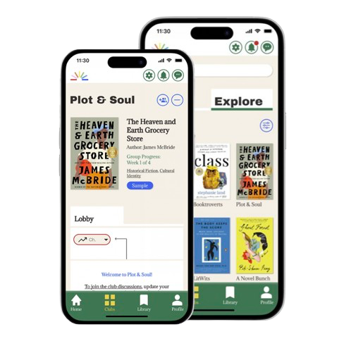
After
= Warm UI, Decluttered, Spoiler-free content.


BRANDING

CONTENT

WEB DESIGN

CONTENT
WEB DESIGN
BRANDING

CONTENT
WEB DESIGN
BRANDING
Let's Connect!

Built with care and caffeine 🤍
© 2025 by Veronica Little
Let's Connect!
Built with care and caffeine 🤍
© 2025 by Veronica Little